Sunday, December 21, 2014


'nurture' ~ beeswax, oil pastels, watercolors, casein paint and acrylics on heavy watercolor paper


 my friends, the solstice is here again!   i wish you a peaceful one...

* * *

The Earth, that is sufficient,
I do not want the constellations any nearer,
I know they are very well where they are,
I know they suffice for those who belong to them.

~ Walt Whitman, from 'Song of the Open Road'


Sunday, November 16, 2014


cover of homemade journal, watercolor and acrylic paint,
3 1/2" x 5 1/2"

last night i repainted the face on the cover of the journal i'm working in...


it looked like this before - it's an old painting that i used to like, until i began to not like it.   just looking at her made me feel kind of tired...    so i tried different things.  you know how it is, you seem to be going from bad to worse and then it all comes together and you like it.   i'm glad i like it now.  it's so much better working in a book with a pleasing cover.  or a book whose cover is a work in progress - that's good too.   i often don't do anything to the cover until i'm near the end.  that way i know what the  'flavor' of the book is and can make the cover have a similar one.

'intercessor #332' ~ watercolor and graphite on stillman and birn 'delta' paper', 3 1/2" x 5 1/2"

i've been painting a lot of intercessors.

watercolor and graphite on stillman and birn 'delta' paper', 3 1/2" x 5 1/2"

many of them.   this is one of the last pages that i painted while sitting outside, on a sunny ridge, watching grasshoppers fly around.   they were out and about that day.

'intercessor #531' ~ watercolor and graphite on stillman and birn 'delta' paper', 3 1/2" x 5 1/2"

 i do miss painting outside.   i came to love that last summer...

'emergency intercessor #513 ~ watercolor and graphite on stillman and birn 'delta' paper', 3 1/2" x 5 1/2"

anyway, intercessors spread beneficial energy around.   they're helpful...

'aquatic intercessor #444' ~ watercolor, graphite, and acrylic paint on stillman and birn 'delta' paper', 3 1/2" x 5 1/2"

i'm not sure why an aquatic intercessor would be in a boat (bowl?), but there she is.

watercolor and graphite on stillman and birn 'delta' paper', 3 1/2" x 5 1/2"


pencil drawings from this morning...  sometimes i don't want the pencil to smudge onto the opposite page, so i spray it with


this.   one coat (also one coat on the cover of the book), and no more smudging.   this is my hands down favorite spray varnish so far.  it has none of the really bad chemicals in it, and is as close to no odor as any spray varnish i've tried.   it creates a soft, satin finish - not high gloss, just soft.  if you read the reviews at the amazon link, one says that it goes on milky - nope, haven't had that experience;  another says that the nozzle is crap - also nope.

i wanted to tell you about that...  

in the last post jeannie left a link with info about emailing stillman and birn to ask for free paper samples.  it's here.

and janine asked about a good book making tutorial.  i like this one by pam carriker.

* * *

"You can't experiment and be flawless at the same time."

~  Nick Bantock, 'The Trickster's Hat'

Sunday, October 26, 2014


'elizabeth's younger sister' ~ watercolors in pocket moleskine w.c. book

it's like this:  when the days are sunny i wanna be out walking (or sitting) in the sun; when the days are cloudy the light isn't good for taking blog pics.   and so the days roll by...

thank you for your suggestions re: brown paper in the last post!   in case it's helpful, here they are:

1.  rolls of brown paper at home depot
2.  rolls and pads of brown paper at walmart
3.  rolls of brown paper at art stores
4.  brown paper bags
5.  bee paper company's brown bogus paper
6.  strathmore's toned tan paper

the brown bogus paper got the  most votes...

colored pencil and watercolors

the only thing i've done on brown paper since the last post!  the paper is from a mailing envelope with a beautiful orange-y cast. the way the green colored pencil on the bottom pops off the paper thrills me!

gansai tambi watercolors in homemade strathmore journal, 4" x 6"

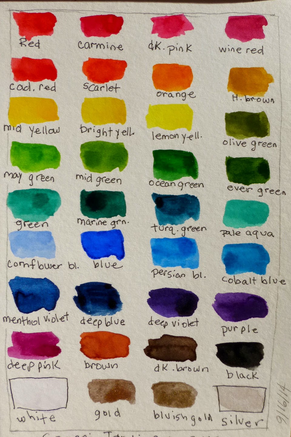
mostly i've been messing around with my new kuretake gansai tambi watercolors.  i wasn't sure if i'd like them but the packaging was gorgeous, and the pale aqua irresistible.  this page is the first time that i used them, and i was impressed by their intensity...    if you click you can see how opaque the colors can be on the top left leaf.


the next day i painted this girl;  i used two colors of green for her hair, then went away to do something else.  when i came back and saw the way the colors had arranged themselves, the interaction between them, i was smitten.


here they are in my art room - they're huge.  i had to have the set of 36 because it's the only one with all of the iridescent colors. 


used with a lot of water they look like regular watercolors, but if you don't use much water they're opaque and glossy - like a glossy gouache.  the black and white are extremely dense.


i've loved using the iridescent colors.   if you click you can see the iridescence on the bird, etc.   in person it makes a lovely difference.


on the left side of the page i used gold over the red,


which you can see here if you click.  


here they are watered way down...  nice and transparent.


unfortunately the pictures don't capture the glossiness of the paints when they're not watered down;  the contrast between the matte of my other watercolors against the glossiness of the gansai tambi makes me smile...


these are all painted in the pocket moleskine watercolor book that i started in early september.


 i loved working in this book.


what it looks like now -  i glued one of my old paintings to the front and covered it with a couple of layers of liquitex satin varnish.

homemade book with s. & b. 'delta' paper

when i had a couple of pages left in the moleskine i read that stillman and birn is now selling the paper that they use in their books by the sheet.  what?!!   i did not hesitate...  i ordered five sheets of the 'delta' paper from ASW and made my next book with it.   it contains - almost exactly - one 22" x 30" sheet of 'delta' paper.  i could not be happier...  

homemade book with s. & b. 'delta' paper

yep, i made it in landscape format!   one day when i was painting outside i realized why landscape format is so useful - it fits in your hand when you're painting.   it took me a long time to figure this out.  ; )


another thing i've gotten since the last post is an 8 oz. container of americana's light buttermilk paint.  this is my absolute favorite paint for covering stuff up that i don't like.  masking tape + americana 'light buttermilk' = a fresh start...   there used to be a face on this page.


painted after looking at this article about maira kalman's new books.  here's another article about maira's new books.  both of these articles have pictures of maira's paintings, of course.

i am feeling the deep maira love right now.

* * *

The pieces that I chose were based on one thing only — a gasp of DELIGHT. 

Isn’t that the only way to curate a life? To live among things that make you gasp with delight? 

~ Maira Kalman,  'My Favorite Things'

Wednesday, September 17, 2014


 colored and 'carbon sketch' pencils on mailing envelope, 3" x 4"

a quick post about something that inspired me last week...   colored pencils on brown paper.


i was attempting to draw the figure in this gorgeous vera rockline painting,

colored pencil on cereal box, peter rush

inspired by colored pencil sketches on cereal boxes that i saw on tumblr.

colored pencil on cereal box, peter rush

they're drawn by peter rush...  at first i thought they were drawn using soft pastels, but no, it's the humble colored pencil!  you can read a great interview with peter on the urban sketcher's blog, where he contributes.

colored and 'carbon sketch' pencils on mailing envelope

all of my drawings are done on a mailing envelope that i received a few days after i saw peter's sketches...  


 i've paper clipped them to a page in my homemade strathmore journal.   there's lots of space between the signatures of a book


 bound like this.  it makes sticking in extra stuff easy.


and in case you don't know about the 'carbon sketch' pencil that i used, it's part graphite, part charcoal, and pure smudging bliss...

of course now i wanna find some empty cereal boxes, and i'm also considering buying a pad of strathmore's toned tan paper...  if you know of other brands of toned paper, i'd love to hear about them.

Sunday, September 7, 2014


untitled ~ watercolors, old paper, oil pastels and graphite on stathmore 400 watercolor paper, 3 1/2" x 51/2"

after my post in july about drawing, i bought 'the drawing mind' by deborah putnoi.   i remember that i read it cover to cover and did most of the exercises,


and somewhere in there drawing stopped seeming like a big deal or intimidating in any way.   looking back, i think "now what was the problem?", ha! 

painted muslin cover on strathmore 400 watercolor paper journal

at about the same time i saw a tutorial on gwen diehn's blog for making a journal with paper from a strathmore pad and a rice bag.   i had the paper but not the rice bag, so i substituted muslin that i painted. i tore each sheet from the strathmore 400 watercolor pad into four pieces, which i then folded in half.  this gave me 3 1/2" x 5 1/2" pages.


i have *loved* working in this book!    the good thing (or one of the good things) about strathmore 400 watercolor paper is that you can put loads of water on it and it will not buckle.  


with my newfound drawing freedom and a small book with heavy watercolor paper in it, i was happy....   i felt like the guy on the left page.  : )


these are some early pages from the book. 


 the paper is very white, so i put a wash of warm grey or raw sienna on a lot of the pages.


realizing how important small page size was to me, i also bought a pocket rhodia webbie for pencil and colored pencil drawings at about this time.  the paper is ivory and super smooth...


lately i've been using neo-color II crayons in it instead of colored pencils...   it's another great place to draw and play with color.


on top of all this wondrousness, i also (thanks to galia), got 'water, paper, paint', by heather smith jones.  this book expanded my watercolor horizons manyfold.  suddenly i saw new ways to express myself with watercolors...


these are some of the  paintings i've done in the pocket moleskine watercolor book that i got after i filled the book in the last post. 


i've been using masking tape to cover up stuff i don't like, and then painting/drawing on top of it.


unlike the little book in the last post, which i only worked in when i was outside, i work in this book inside and out. 


i *like* landscape orientation now, something i never thought would happen!


i've been practicing painting faces using only watercolors - no colored pencil, oil pastels, etc.


one thing that i thought might be worth sharing is the greys i use (besides payne's grey, which i don't think of as a grey, but some kind of paint magic).   i use these greys more than any other color/s...  left to right: sennelier warm grey, sennelier grey (a dark green grey), and holbein gouache grey #2.


this is where my drawing - and painting - journey stands now.  thank you to everyone who commented on my july drawing post; i enjoyed hearing your thoughts...   as for erwin lian and 'the perfect sketchbook', he exceeded his kickstarter goal, thanks to the support of many artists.

* * * 

“Stop thinking about artworks as objects, and start thinking about them as triggers for experiences.” 

~ Brian Eno, "On Art"